
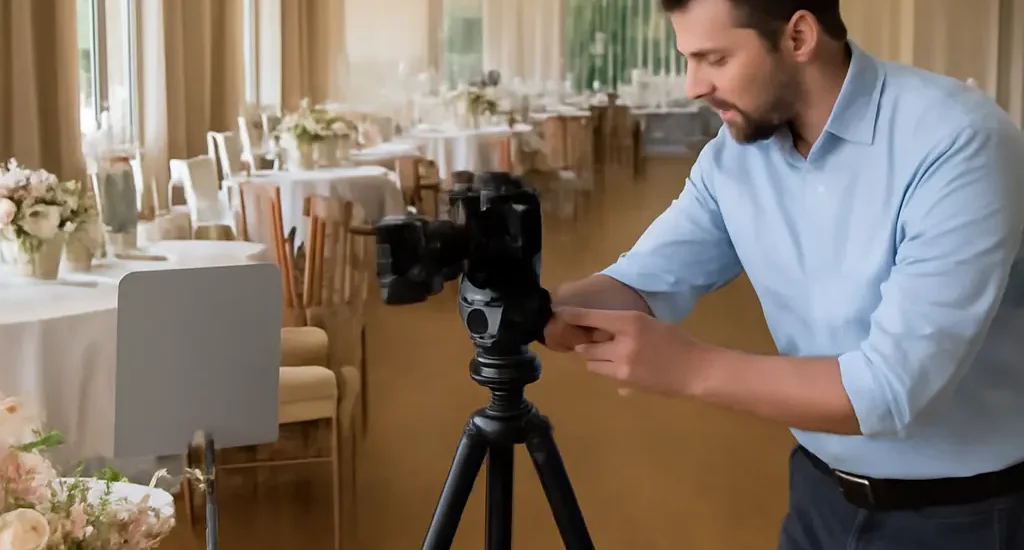
How Professional Wedding Photographers Keep Colors Honest and Stunning
Color accuracy in wedding photography is the faithful rendering of the colors couples and guests experienced—from skin tones and clothing to flowers, décor, and venue lighting—while still allowing for a considered artistic style. Professional wedding photographers keep colors honest and visually compelling through consistent white balance, controlled exposure, calibrated displays, and careful editing. These steps matter because wedding images combine changing daylight, indoor lighting, and emotionally significant details; a flower that looks cream rather than white or skin rendered unnaturally orange can change how a moment is remembered. This guide explains how photographers manage those conditions, build reliable workflows, and balance accuracy with a distinctive look.
Photographers define color accuracy as faithful, consistent color rendering
Color accuracy describes how closely an image’s recorded and displayed colors correspond to the colors of the scene under its lighting. It is not the same as making every image look identical or removing all creative choices. The International Color Consortium (ICC) describes color management as the use of profiles to translate color between devices, helping preserve predictable appearance across cameras, editing software, monitors, and output. In wedding work, that means keeping recognizable skin tones and important details credible while allowing deliberate choices in contrast, warmth, and mood.
The challenge is practical as well as technical. A wedding photographer may move from open shade to direct sun, then into a reception lit by warm bulbs and colored LEDs. Different light sources can make the same white dress appear blue, yellow, or green in a photograph. There is no single universal “correct” look for every scene, but a dependable workflow helps the photographer make intentional choices rather than letting inconsistent lighting or devices make them accidentally.
White balance establishes the color foundation
White balance is the camera’s or editing software’s adjustment for the color cast of a light source. A neutral white or gray object can provide a reference: if it appears neutral under the scene’s light, nearby colors are easier to judge. Photographers may use automatic white balance, a preset such as daylight or tungsten, a custom measurement, or a RAW editor’s temperature and tint controls.
A kelvin value describes the camera’s white-balance temperature adjustment, but it does not completely describe every light source. Fluorescent and LED lighting can add green or magenta casts that require a tint adjustment as well. A gray card or neutral reference frame can help establish a starting point, especially when the photographer records it again after lighting conditions change. For a candlelit reception, the photographer may retain some warmth to preserve atmosphere rather than neutralizing the scene until it feels cold.
Color management connects camera, monitor, and print
Color management is the process of using device profiles and controlled viewing conditions to make color transitions more predictable. A camera sensor, an editing monitor, a phone, and a print do not reproduce color in exactly the same way. ICC profiles help software interpret and translate color information, but they cannot make every screen identical or recover color information that was never captured.
Photographers therefore calibrate and profile their monitors, edit in a managed color space, and check the requirements of their print lab or album maker. The ICC’s color-management guidance explains why profiles matter: devices have different color capabilities, so a defined translation is needed as images move between them. For couples, the practical benefit is fewer surprises when an edited gallery is viewed on another screen or selected images are printed.
Photographers control color at capture before editing
A strong editing workflow begins at the wedding. Photographers make exposure decisions, observe how light falls on people and objects, and record files that retain useful detail for later adjustment. This does not mean every frame must be technically perfect in camera; it means reducing avoidable problems so post-production can refine the image instead of trying to rescue it.
RAW files preserve adjustment flexibility
A RAW file stores largely unprocessed sensor data and allows substantial changes to white balance and tonal rendering during editing. JPEG files are processed in-camera and can be convenient, but their white balance, sharpening, and tone decisions are more baked into the image. RAW capture is particularly useful when a ceremony moves between sunlight and shade or when a reception includes several kinds of artificial light.
RAW is not a guarantee of accurate color: it still depends on exposure, sensor response, software interpretation, and the photographer’s choices. It does, however, provide more room to correct a color cast and recover tonal information than a heavily compressed final image. Photographers commonly create JPEG previews for quick review while retaining RAW files for final processing.
Exposure protects skin, fabric, and floral detail
Exposure determines how much light is recorded. Wedding photographers monitor highlights and shadows so a white gown does not lose all fabric texture and darker skin tones do not become muddy or underexposed. The camera histogram and highlight warnings offer useful checks, although they represent the camera’s preview rather than a perfect measurement of the final RAW file.
A practical example is a bride standing beside a bright window. Exposing only for the window can leave the face too dark, while exposing for the face may sacrifice detail in the brightest parts of the dress. The photographer can reposition the couple, use fill light, or accept some clipped window detail to preserve the people and garment that matter most. Accurate color depends on this tonal foundation: heavily clipped highlights and deeply crushed shadows contain less information for natural-looking color adjustments.
Mixed lighting requires selective decisions
Mixed lighting occurs when a scene contains sources with different color characteristics, such as daylight from a window and warm indoor bulbs. A single global white-balance setting may neutralize one area while making another look unnatural. Photographers can change their position, turn off or avoid distracting lights when practical, use flash with an appropriate color gel, or make localized adjustments during editing.
For example, a reception portrait made under amber ceiling lights and a blue DJ spotlight may contain two competing casts on the same person. A photographer might use flash to create a more consistent key light while allowing some ambient color to remain in the background. The goal is not necessarily to make every source neutral; it is to keep faces and important details believable without erasing the atmosphere of the event.
Photographers edit for consistency without erasing the wedding’s character
Editing is the stage where photographers align images from different locations and lighting conditions into a coherent gallery. They adjust white balance, exposure, contrast, and color intensity, then review related photographs together. Consistency does not require every image to have identical color; it means the collection feels intentional and people, clothing, and décor remain recognizable across changing scenes.
Calibration and soft proofing make evaluation more reliable
Monitor calibration adjusts a display toward a known reference, while profiling records how that particular monitor renders color. Together, these steps reduce the risk of editing images too bright, too dark, or with a color cast that is visible only on the photographer’s own screen. A controlled room with moderate, consistent lighting also helps because bright or strongly colored surroundings can influence visual judgment.
Soft proofing previews how an image may appear within the color limits of a particular printer and paper profile. Since a print cannot reproduce every color visible on a bright monitor, soft proofing can reveal colors that may shift or lose saturation in print. Photographers delivering albums can use this preview to make modest adjustments before approving production; couples can ask whether their photographer checks print output as well as screen galleries.
Skin tones and white garments act as important visual checks
Skin tone is a sensitive reference because viewers notice unnatural shifts quickly, yet real skin varies widely in hue, brightness, and undertone. Photographers should not force every person toward one preset or a single numerical target. Instead, they consider the light, the person’s natural appearance, and consistency across a sequence of images. White clothing can also reveal color casts, but a gown may be ivory, champagne, or another intentional shade rather than pure neutral white.
A useful review compares portraits made under similar light and checks whether faces, dresses, and other familiar objects remain plausible. This is more reliable than increasing saturation simply because a monitor preview looks dull. The aim is faithful representation, not an artificial standard in which every complexion or wedding dress is pushed to the same color.
Presets and selective adjustments support a coherent style
A preset is a saved group of editing settings. It can speed up a photographer’s workflow and help establish a recognizable style, but it cannot correctly interpret every lighting condition. Applying one preset to images made in shade, tungsten light, and colored reception lighting may produce inconsistent skin and décor colors. Professionals typically use presets as a starting point, then adjust individual photographs or lighting groups.
Selective adjustments target particular areas or color ranges rather than changing the whole frame. A photographer may reduce a green cast on a face without removing green foliage, or lower the saturation of a vivid LED-lit wall while keeping the couple’s clothing natural. These local choices should be restrained: aggressive color changes can create visible transitions, unnatural skin, or a mismatch between adjacent images.
Photographers validate the final gallery across viewing and output conditions
A finished image is experienced on many devices and in print, so a professional workflow includes quality checks after editing. The photographer reviews sequences for sudden shifts in brightness or color, checks export settings, and confirms that files meet the delivery or print provider’s specifications. The ICC’s guidance on profiles supports this cross-device approach, while printer and album-lab specifications determine the practical settings needed for physical products.
Gallery review catches shifts between scenes
A contact sheet or side-by-side review makes it easier to spot a single image that is unusually green, magenta, warm, or cool among otherwise consistent photographs. The photographer can compare images from the same part of the day while recognizing that the ceremony, portraits, and reception may intentionally have different atmospheres. This kind of sequence review is especially useful after batch editing, when one adjustment may affect many photographs at once.
Print checks reveal differences a screen cannot show
Prints reflect light rather than emitting it, so they can appear less luminous than a backlit display. Paper surface, ink, printer condition, and viewing light all influence the result. A photographer who orders a test print or reviews an album proof can catch changes in shadow detail, warmth, or saturation before final delivery. The exact appearance depends on the lab and materials, which is why print-specific profiles and proofing are valuable.
Couples can support accurate results with clear references
Couples can help by sharing the visual priorities that matter most: the true shade of a dress, a meaningful heirloom, a particular floral palette, or a preference for warm rather than neutral reception images. They can also ask how the photographer handles mixed lighting, monitor calibration, and album proofs. A photographer should explain the intended balance between documentary accuracy and artistic style, since color preferences are partly subjective.
When reviewing a gallery, it is sensible to view it on a reasonably reliable screen and avoid judging color under strongly tinted room lighting. If a detail appears important but questionable, a couple can identify the specific image and color concern rather than requesting a global change that may make other photographs less natural.
Conclusion: Honest wedding color depends on a complete workflow
Professional wedding photographers keep colors honest and stunning by combining sound capture with thoughtful editing and careful validation. White balance establishes a useful starting point; RAW capture and exposure protect room for adjustment; mixed-light strategies address difficult scenes; and calibrated displays, selective edits, gallery reviews, and print proofs help maintain consistency. Color management does not eliminate artistic style—it makes that style more deliberate and dependable.
For couples, the most useful next step is to discuss color priorities and ask how images are reviewed for both screens and prints. For photographers, reviewing camera, monitor, and lab workflows—and testing a sample print—can reveal where color shifts enter the process. These habits help preserve not just a polished look, but the recognizable people, clothing, flowers, and atmosphere that made the wedding meaningful.
Sources: International Color Consortium, “About the ICC,” https://www.color.org/abouticc.xalter; International Color Consortium, “Color Management,” https://www.color.org/; Adobe, “White balance,” https://helpx.adobe.com/camera-raw/using/white-balance.html; Adobe, “Camera Raw image processing,” https://helpx.adobe.com/camera-raw/using/image-processing.html; Adobe, “Soft-proofing colors,” https://helpx.adobe.com/photoshop/using/proofing-colors.html
